CSS: How to Indicate Container Overflow, When There Is Overflow
Published on Dec 28, 2024 (updated Feb 4, 2025), filed under development, css, design. (Share this post, e.g., on Mastodon.)
You have a block of text that you can’t shorten and yet that you don’t want to give too much space, so as not to draw attention away from other content. It’s useful metadata that you like to show. What do you do?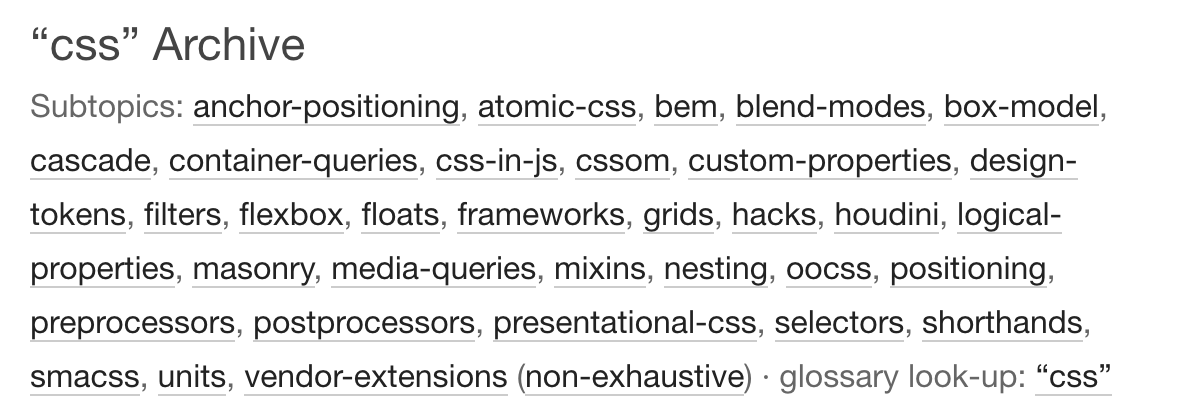
This was a question I just had to answer on Frontend Dogma, to manage related tags (spoilerless example: the SEO tag/archive). Interested in doing this with as little code as possible, none of that in the markup, here’s how I solved it, for now.
Before we begin, this is just one solution. And, it fits into the thinking of iterations, some—sometimes many—of which come with trade-offs.
What was important to me was a) to limit the text to three lines, and b) provide some sort of affordance if not all content was shown.
Now, there is something in the works here with line-clamp, but that doesn’t work yet (at least I couldn’t get it to work).
With this not being available, the solution I opted for consisted of three parts:
- a vertical overflow
- a hover and focus escape
- an affordance to indicate if not everything is shown
1. The Vertical Overflow
This is easy—provide a maximum height [improved thanks to Dennis Frank], clip it (overflow is enough, no need to add extra characters for overflow-y):
#meta {
  max-height: 3lh;
  overflow: auto;
}
2. Hover and Focus Escape
To display the content on hover but also when navigating through the respective area, some sort of escape is useful:
#meta:is(:hover, :has(a:focus)) {
  max-height: none;
}
This way, users get to check and access all the content on hovering and when tabbing through. The content shows when there’s a reasonable chance it’s needed.
3. An Affordance
However, with clipping being poor (something like text-overflow: ellipsis wouldn’t apply, even if it weren’t considered problematic) and us living in nearly scrollbar-less times (which may deserve more attention), how to indicate that “something was happening” here (i.e., content not being shown), when that something was happening?
For this, Robin Rendle (and Bramus Van Damme) provided useful pointers. Robin wrote about the issue in Can You Detect Overflow With CSS?, which extended Bramus’s work in Solved by CSS Scroll-Driven Animations: Detect if an Element Can Scroll or Not.
I cut that solution back a bit:
#meta {
  animation: scroll-detection linear;
  animation-timeline: scroll(self);
  border-right: var(--scroll-value);
  --scroll-value: var(--scroll-ability) 1px dashed var(--brand); /* “brand” (brand color) is unrelated to the solution */
}

@keyframes scroll-detection {
  from,
  to {
    --scroll-ability: ;
  }
}
(All code simplified for this article.)
The adjustment made Robin’s solution easier to apply to other properties (here border rather than background), and consisted in displaying a dashed border on “condensed” meta sections, and only on those.
The solution is live (see the CSS archives) and under test: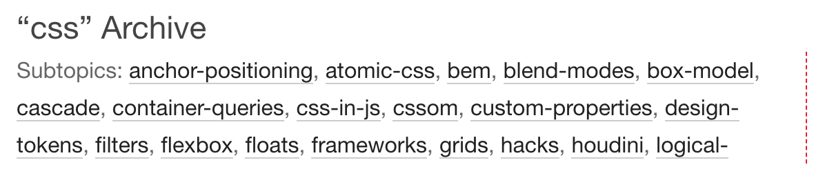
“Under test” because the affordance may not be strong enough, the aesthetics and usefulness of cut-off text like “logical-” are debatable, and the scroll detection solution seems to work only in Chromium-based browsers so far. Accordingly, I’m looking into additional improvements. I also like to take the time and do more tests in screen readers, to ensure this doesn’t inadvertently create a barrier.
As suggested, the solution is likely to be a temporary one, too—line-clamp looks like the way to go about this in the future, so I’ve marked the respective section in the code to review this possibility again.
Yet then, that’s it—an option to indicate container overflow, shared liberally to document and test the approach.
Update (February 4, 2025)
I rolled back the solution on Frontend Dogma—not because the CSS part wouldn’t work (it does), but because on mobile, Chrome and Vivaldi (and likely other browsers) get confused over what is being clicked on when the click is on items in the lower, formerly invisible part of the overflow area. The click would first register as affecting something in the upper, originally visible part, thereby having users hit a different link than intended. (Only when navigating back and clicking again would the correct link be activated.) This much looks like a bug. I haven’t filed a report yet, but hope to check whether this is a known issue, and prepare a test case.
About Me

I’m Jens (long: Jens Oliver Meiert), and I’m an engineering lead, guerrilla philosopher, and indie publisher. I’ve worked as a technical lead and engineering manager at various companies, including Google; I’m an open-source developer and a contributor to web standards (like HTML, CSS, WCAG); and I write and review books for O’Reilly and Frontend Dogma.
I love trying things, not only in web development and engineering management, but also with respect to politics and philosophy. Here on meiert.com I talk about some of my experiences and perspectives. (Please share feedback—interpret charitably, keep it friendly, but do be critical.)