A Short Story of the Google Error Page
Published on Oct 6, 2022 (updated Oct 14, 2024), filed under misc. (Share this post, e.g., on Mastodon or on Bluesky.)
Before we begin, this is a personal post, and not one endorsed by Google. Although it was reviewed, I’m also telling it by memory, meaning I may have gotten details wrong. (I’ve worked at Google from 2008–2013, so it has been a while.)
In its 24 years, Google has had two error pages *. One for 13 years, the other and present one, for 11 years.
If you haven’t used Google before 2011, this is how the error page looked like: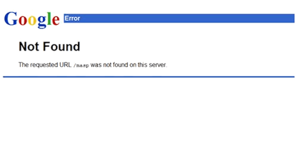
Since then, it looks like this (see for yourself):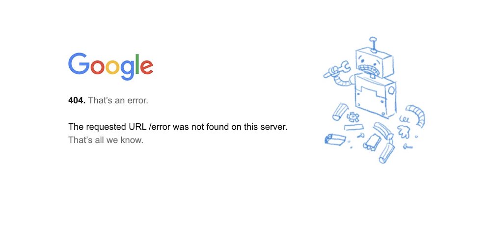
But what happened? Let me add detail to the story I had sketched on Twitter.
The Google Webmaster Team
On the old Webmaster Team, we had been responsible for most of Google’s informational pages—Marketing and Corporate Communications campaigns and microsites, Investor Relations information, the Google careers site, and many more, including the Google error page. (In 2014, I wrote a little about that and the successor team’s work, when passionately noting what looked like a decline in output quality.)
That error page came up here and there, as we all knew it wasn’t up to standard. It was dated, and smelling like the 90s.
Accordingly, there had been light conversations to do something with the page. Just who should do that work, and what value could we add to it?
At the time, I was one of the team’s tech leads, and had capacity to drive what looked like a moderately low-hanging fruit. I don’t recall any objections to making this an OKR for probably the first quarter of 2011. As this didn’t appear too resource-consuming to my manager then, Todd Markelz, it was also okay to pair up with some more people on the team, like Susie Sahim, one of our team’s designers and illustrators (you might know some of her doodles!). That answered the “who.”
For the “what,” it turned out we, or I, had been a little naive about what was possible and realistic on the page.
Error Page Requirements
The general idea was to make the error page more useful. Give context on the error that occurred, provide navigation options, offer search functionality, perhaps add some dynamic features.
But it quickly became clear that wasn’t going to work. For one, the system here was different from what we were using to serve standard pages. For another, we had to assume that other systems, like those serving assets, would not be available, either. We learned that other systems and teams were consuming and modifying the page. And, of course, the page had to be blazing fast—not usually a problem, unless you’re competing against a page that was essentially plain text.
Within a brief timeframe, all our ideas vaporized, with the feedback translating to a mandate of “change as little as possible, and do everything with one file.”
In a way that made our work also easier, because there was less to design and code and test—but it was very different from what we had had in mind.
Susie and I then went to work—I focused on the general content and layout, and coding the page, when Susie created the main illustration, and advised on the design.
Owing to the thriving meme culture on the Web and also at Google, this was also when I had the idea of adding the friendly “!!1” to the page title. (I received probably a dozen internal bug reports about this 😅)
Early on, too, did I like the idea of calling out our inability to provide more error context and options (“that’s all we know”). We really didn’t know anything, so why not be transparent about it! And the same, of course, applied to dryly pointing out that an error occurred (“that’s an error”).
On the design side we ended up improvising, too: The graphic used had been a sketch, something Susie had planned to polish for production. However, as everyone liked it the way it was, it wasn’t touched again.
Quality in Simplicity
The result of all of this is largely what you can still see today:
Thinking about all the limitations, I still find the outcome all googley.
There are also a few more things that seem pretty cool:
The page must be one of the most-frequented pages on the planet. It’s weird to think of it, but after having worked on a number of popular websites (including several at Google), this may still be the page I created that has received the most traffic. An error page, of all pages.
The code of the page has used a fairly advanced HTML writing style from the start, namely valid, semantic, accessible, required-only. (I know, I call this advanced, but then it’s also what I’m doing for a living 😉) There were some changes in the meantime—for example, the logo construct has been redone—, but fortunately nothing that made the page non-conformant with web standards. So this is a high-traffic Google page that’s also valid. (Don’t jinx it.)
On the design side, I don’t think anything changed but the Google logo, which was last updated in 2015. Yet then—didn’t the page age reasonably well? You be the judge.
_ This is the short story of the Google error page, and one I feel honored having been able to contribute to.
As a closing note: My former manager, Todd, and I have a bet if this page will last longer than the first Google error page. What do you think? Leave a comment (while still open), or share your own bet as a response to the tweet for this post. (Googlers—forget about the page again, at least until 2025 😉)
Many thanks to Todd and Susie for reviewing and sharing feedback on this post!
* To the best of my knowledge, which means, I could be wrong. If you have pointers that there were other error pages during Google’s early years—apart from having none, which is an industry classic—, I’m happy to update this post.
About Me

I’m Jens (long: Jens Oliver Meiert), and I’m an engineering lead, guerrilla philosopher, and indie publisher. I’ve worked as a technical lead and engineering manager for companies you use every day (like Google) and companies you’ve never heard of, I’m an occasional contributor to web standards (like HTML, CSS, WCAG), and I write and review books for O’Reilly and Frontend Dogma.
I love trying things, not only in web development and engineering management, but also with respect to politics and philosophy. Here on meiert.com I talk about some of my experiences and perspectives. (Please share feedback: Interpret charitably, but do be critical.)