Print Style Sheets and URLs
Published on Jun 14, 2011 (updated Feb 5, 2024), filed under development, css, design. (Share this post, e.g. on Mastodon or on Bluesky.)
This and 133 other posts are also available as a well-behaved ebook: On Web Development.
Print style sheets are awesome. They’re easy to write, too. Site owners and developers who care about print typically know what to do. Alas there’s one thing that’s done rather the wrong than in any right way: printing URLs, typically via the content property.
Common Mistakes
Two:
Not obtaining data on how many users actually print out documents and go to the length of memorizing or writing down URLs they saw on the print-out to then type those URLs into the next machine they find. (There may be neither users who do that nor data to prove it.)
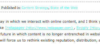
Displaying URLs in the wrong context, namely copy text (see the figure above). While one may maintain some optimism that URLs are actually accessed later, expanded in regular text they do but one thing—disrupt the reading flow.
In other words, don’t expand URLs in print because you can. Then, as always, exceptions prove the rule: Special forms of content like link lists, for example, can still benefit from expanding all URLs in print; important URLs may even want to be shown on screen. We just need to exercise caution.
About Me
I’m Jens (long: Jens Oliver Meiert), and I’m an engineering lead, guerrilla philosopher, and indie publisher. I’ve worked as a technical lead and engineering manager for companies you use every day (like Google) and companies you’ve never heard of, I’m an occasional contributor to web standards (like HTML, CSS, WCAG), and I write and review books for O’Reilly and Frontend Dogma.
I love trying things, not only in web development and engineering management, but also with respect to politics and philosophy. Here on meiert.com I talk about some of my experiences and perspectives. (Please share feedback: Interpret charitably, but do be critical.)

