A Word on Contemporary Web Design
Published on February 5, 2014 (↻ July 12, 2024), filed under Development and Design (RSS feed for all categories).
This and many other posts are also available as a pretty, well-behaved ebook: On Web Development.
These days, and as juror for Design Made in Germany I see a lot of websites, many a designer knows how to make a page appear spacious, even grandiose. Alas, as many appear to have forgotten how to use space effectively, putting the content on the table, designing honestly and with focus.

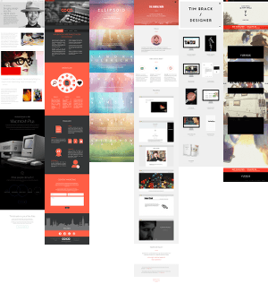
Figure: Six random sample pages using up to 6,270 pixels length for two sentences. The truly spectacular ones broke the screen-capturing tools (seriously).
It seems to have become an art form to start off dumbing down content “for” the user—or to begin with very little content—, grab a number of unrelated but pretty-to-look-at photographs or icons, garnish them with “HTML5,” misspelling intended, and throw it all on one endlessly scrolling—what could go wrong—page.
This type of contemporary web design is harmful. It’s harmful because it’s package design. It’s not content design. Personally, I’ve had it.
This type of design may match up nicely with the substance-void world the media shows us, but if that’s the best our profession can create then it’s not just my personal preference to endorse Craiglist-esque forms of design, but also my conviction that 1999 pragmatic table-based design has won a late round.
Web designers must be able to produce websites and apps that can handle, not attempt to pity, information density. Yes, there’s negative space and such. But there’s also such a thing as missing the point.
PS.
If you like a taste of numbers, a few months back, already suspicious of information-poor sites, I looked at a sample of popular sites and counted the words in the immediately visible section of an arbitrary 1,024×768 pixels browser window. Apple: 13 words; Microsoft: 15 words; CNN: 124 words; the New York Times: 294 words; Edward Tufte: 390 words. In comparison: a tweet: ø <23 words; a text message ø <27 words. But there’s more to do and say here, and so it’s fair to point out problems with these numbers.
About Me

I’m Jens (long: Jens Oliver Meiert), and I’m a frontend engineering leader and tech author/publisher. I’ve worked as a technical lead for companies like Google and as an engineering manager for companies like Miro, I’m a contributor to several web standards, and I write and review books for O’Reilly and Frontend Dogma.
I love trying things, not only in web development (and engineering management), but also in other areas like philosophy. Here on meiert.com I share some of my experiences and views. (Please be critical, interpret charitably, and give feedback.)
Comments (Closed)
-
On February 5, 2014, 20:55 CET, Felix said:
I was with you until the PS. You’re comparing a range of different site types, which isn’t entirely fair (not sure if that was your point). As you can see, the types cluster: product pages have 13-15 words visible, news pages 124-294, academic literature pages 390. I would argue that design done right actually fits the content - and these examples do that just fine.
-
On February 5, 2014, 21:11 CET, Jens Oliver Meiert said:
Thanks Felix—I added a clarifying sentence. I decided to just make it a note in the post scriptum for that reason. These are also not quite the sites I’m referring to in the main article. Some of them just happen to suffer from too low—my argument—information density too.
-
On February 6, 2014, 10:24 CET, Steffen said:
If the 15 words visible are exactly why I’m on this site, that’s indeed focused.
I believe it’s very hard to find out what to put on a page and what to remove to met users’ expectations. Perhaps these pages do know - and achieve their goal to be referred to in a stumbleupon page 😊 -
On February 6, 2014, 13:06 CET, James said:
I think some designs are made for the designer rather than the target audience and people are placing lots of pretty pictures on sites to catch the eye but are not particularly informative. Don’t get me wrong you want to make sure you get people’s attention, but you also want people to be able to find things on your site, sot here has to be a practical application in there somewhere.
-
On February 7, 2014, 17:51 CET, Jens Oliver Meiert said:
Steffen, if “why you’re on their site” is not one way street though.
(The spammers are quick this time. Comments removed.)
Read More
Maybe of interest to you, too:
- Next: Lessons From Writing a Dream Journal
- Previous: HTML Explained in 123 Tweets: The Google #htmltuesday Archive
- More under Development or Design
- More from 2014
- Most popular posts
Looking for a way to comment? Comments have been disabled, unfortunately.

Get a good look at web development? Try WebGlossary.info—and The Web Development Glossary 3K. With explanations and definitions for thousands of terms of web development, web design, and related fields, building on Wikipedia as well as MDN Web Docs. Available at Apple Books, Kobo, Google Play Books, and Leanpub.
