About the Design and Code of meiert.com
If you want a recent example for how I code websites, see Frontend Dogma or HH Kaffee (code). For more behind my thinking, check my articles or books. For the history and context of meiert.com, read on.
The current design and code of this site date back to 2005, when I worked on what I first called “meiert.com 9,” soon morphed into “meiert.com X,” the supposed tenth redo of the site. The first version of what you’re looking at now was like this:
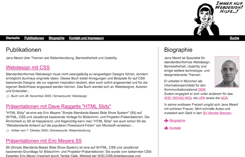
Figure: meiert.com in November 2005.
That within the first six years of this website (1999–2005), there were up to nine different versions, and then, within the nearly twenty years since, there were only one and a half, may tell us something—if we, which we will, discount the finding-founding years and rule out reluctance to change. What it should tell us follows now, in brief, perhaps cryptically, and if you don’t want to read, take two things out of this now: Web design is founded on principles, and web design is a process.
Underlying Principles
Generally speaking, what drives my work on meiert.com is what drives my work behind any website, whether professional or personal: the desire for high quality, paired with efficiency. (There are a few more principles that guide my work, some of which are explained in Principles of Web Development.)
Both desires should be understandable and maybe self-explanatory, but then they’re so important they do deserve an extra line or two.
Quality is so immensely important (that reminds of something) because it’s both, dare I say this, ethical and professional. Quality increases the utility of a work and with that its use for others—truly a utilitarian idea—, and quality is a, maybe the, differentiating factor between the work of an amateur and that of a professional.
Efficiency is important, too, for it’s a matter of economy. Building things that are slower than they need to be, or doing them more slowly than they need to be done, is not economic, and bad for our users and for ourselves. The aspect of professionalism shines through again, for producing something slow, slowly, is something that can be done by anyone, while producing fast things fast can only be done by experts. Though a simplification of efficiency, that’s the idea.
The desire to do things really, really well and to do them professionally may lead many to quality and efficiency, and I consider these two truly excellent base principles.
The Design Thinking Behind meiert.com
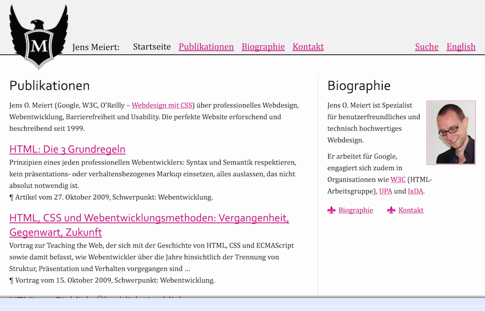
Figure: meiert.com in June 2010 (note the brief experiment with Google Friend Connect).
Beauty lies in the eye of the beholder, but design may be far less about beauty than is commonly thought—design is, first and foremost, about purpose and usability. (When it comes to my take on design, I have strong convictions, one being that the design discipline for us to look at is industrial design. Achieve maximum contrast by looking at the position that understands decoration as design, and then mistakes decoration for all design.)
I’ll illustrate some general design thinking by means of the specific thinking I applied when designing and maintaining meiert.com. In no particular order, and with no claim for completeness.
- Branding:
-
It should be clear what website a visitor is on. The eagle with the “M,” as the subject of my family crest, functions as the main carrier of this information, and as such it’s present on all pages. I’ve been adjusting my approach from reducing the size of my logo (it used to be way too big and prominent) to removing my name, and thus taken a risk weakening the branding, but I’m okay with this weakening for making myself a “brand” is not what drives me. Today, I prefer working with the visual identity which is the crest.
- Simplicity:
-
The design of meiert.com has been meant and is meant to be simple. That doesn’t imply usability, but aids it alongside other factors like following conventions. (I once ran a campaign to recruit users for testing, but that didn’t work out. For lack of reliable testing I won’t explicitly call out usability in this list.)
- Conventions:
-
The design should follow usability conventions where possible (On Web Development contains an exclusive translation of some popular conventions). This is, and perhaps should be, most clear in two areas: forms and links. For forms this site uses the default user agent styling, to allow users to recognize and use forms more easily, and not to reinvent the wheel with a risk of losing these users. For links it doesn’t use the classical underlined blue-red-purple scheme, but still keeps underlines and still highlights visited links.
- Golden Section:
-
What has been rumored to make for appeal has also impressed me in my design work: applying the Golden Section, or Golden Rule. Impressive, then, is not the extent to which I made use of it: only the ratio between (maximized) content width to side column roughly equals the Golden Ratio of 1.618-something.
- Legibility and readability:
-
Throwing both in the same bucket (legibility is “the ease with which a reader can recognize individual characters in text,” readability “the ease with which a reader can recognize words, sentences, and paragraphs”), meiert.com has content, and that content should be easy and pleasant to read. The approach that I chose was then influenced by three factors: typography, support (including performance), and branding. Typography as the biggest factor of the three informed the font decisions in terms of the two items in question, legibility and readability, but also appeal. Back in 2004 and 2005 I, for that reason, analyzed several studies on the topic (including, for example, A Comparison of Popular Online Fonts). Support was more important back then, when there were no web fonts, but these days, with web fonts allowing us much more typographic choice, performance is a related concern in that both support and performance can suggest to prefer system over web fonts. Branding then has been a weak factor, but marrying all three of them has led me to use my signature font, the Sabon, as the primary font, with Palatino and Georgia as legible and appealing enough fallback fonts. [I’ve adjusted the fonts again in the meantime.]
- Accessibility:
-
A content site is traditionally easier to build accessibly than one that offers a service or entertainment, and thus accessibility considerations were mostly about colors and typography. The color choice aims at good contrast while still allowing for some “branding” (white-pink-lightgray); contrast then was to lessen issues like “rivers of whitespace” (German readers may remember an old article about vision and web design).
- Information design:
-
That, most of the time, web design is information design is probably another secret to be shared more broadly. That this is so may be clear enough to need little explanation: Once websites contain information, designing them must constitute information design. Hence when we look into that field, and inevitably pick up a book by Edward Tufte, we learn a thing or two about web design as well. An idea I find impactful for web design is the one of chart junk. Chart junk, however, is relatively easy to address: Reduce and dim down whatever isn’t relevant content. The prime consequence for meiert.com was a careful, most deliberate use of lines: they serve a purpose by guiding the eye, but as non-content they should not distract from it. Hence, I used a very light gray, by borrowing directly from Tufte. There, information design.
The Code Principles Behind meiert.com
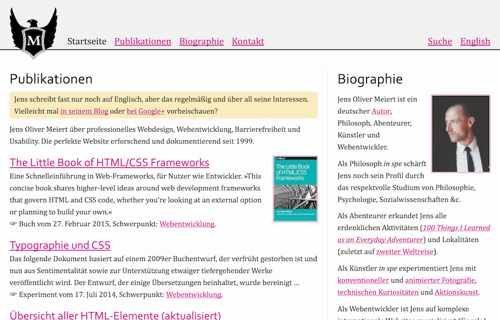
Figure: meiert.com in March 2015.
- Tailoring:
-
As I—thankfully, not alone—have been promoting for many, many years, on this site and in my books on web development, frameworks, and coding standards, tailoring is key to professional web development. Tailoring requires knowing one’s needs and to then write and maintain all code towards these targets.
- Simplicity:
-
Closely related to the idea of tailoring (and a tangent as in the design rationale above) is the one of simplicity. The simplest patterns last.
- Quality:
-
The main motivation, with its success not trivial to measure, is good quality of code. What does that mean? As I’m saying in my little book on quality control, “website quality control includes the means to determine a) whether websites meet our own expectations and b) to what degree our websites meet professional best practices.” Quality is difficult to define and depends, from my point of view, on our goals as well as proven practices. Those govern meiert.com, too.
- Maintenance:
-
There’s a series on this site, Website Optimization Measures. That series reflects well the spirit needed for any web project, which is to maintain it. The reason is that even a near-perfect web project, unmaintained, deteriorates and gets outdated; rarely does our work even get to near-perfect (the rule here is: the simpler, the better, and that in turn tends to limit value). As this point is not strictly a code principle, let’s move on to one that is:
- Don’t Repeat Yourself (DRY):
-
This is a principle that I’m holding high here and elsewhere. In my own projects, however, I’m in some ways extreme in my avoiding of repetition (particularly in style sheets), but also allowing for it using a partially static publishing system (which is to say, no system). Doing and storing things only once (including declarations) is a tremendous help to effective code and its maintenance.
- Cost of problem:
-
Web development happens between research and production; that “between” is a good reminder to neither fall for every fad, but not to become too pragmatic, either. A good example
is—was, but for the old argument’s sake and because of pending markup updates I’m going to leave this section as is for the moment—this site’s use of an XHTML document type: Like any other project I’ve done since 2008, it should instead use HTML. XHTML, even if truly delivered as such, is too heavy (I’m a fan of omitting optional tags), and the underlying ideas, in my view, antiquated. We need fault-tolerant HTML, because HTML has to be easy to work with. (That does not imply experts to write sloppy HTML—writing good HTML makes web development such a challenge, for good HTML moves complexity into style sheets and scripts.) Back in 2005, XHTML was still alive though, with good ideas for how to make XHTML 2.0 the “ideal” markup language. The conflict between 2005’s best practice of using XHTML and today’s best practice of using HTML is something I’ve weighed using cost calculations, for despite all idealism, development cost matters to me. The point is, the cost of the problem of confusing people with an XHTML doctype has so far been lower than the cost of refactoring this whole site to use the preferable and more efficient HTML doctype—so far, until 2019, when the equation flipped for me.
The Process Behind meiert.com
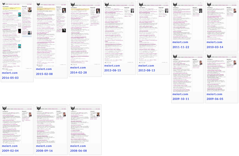
Figure: Partial design history of meiert.com, as per DomainTools (one of the tools I collect on Frontend Dogma).
- Iteration:
-
meiert.com subscribes to the idea of web design as a process. Essentially, start off the best basis you can create, then iterate, iterate, iterate. Excluding major changes in strategy, content, and structure, this approach is efficient and economic. It works best though with said basis, where the markup needs to be of good quality, and it hinges on regular maintenance, where best practices count. I believe that this site is a proof of concept for web design as a process.
- Reviews and rewrites:
-
For the content of meiert.com I’ve installed a periodic review process in which I cycle through all articles to check on their accuracy, grammar, and tone. (The URL scheme, formerly including the publishing date, is not a good indicator for up-to-dateness here.) Dated articles are marked as such. This part of the process is important to me for I wish to provide useful information, and also to cover up my mistakes. (Smiley.) I believe more non-news websites could employ such reviews.
- Cost of problem vs. cost of solution:
-
The process of this site also takes into account economic considerations. Some of this thinking I shared in the last section, when “XHTML” had for some time beat HTML in a good example. As idealists we should watch out for dogma and turning into fanatics. Entirely ignoring cost, on both ends of problem and solution, resembles fanatism more than idealism.
❧ This I just pulled out of my hair, but I’ll amend where I see fit in the future. I wish this article to give the interested website owner, designer, and developer an impression of how and under what principles websites can be operated. Mileage may vary, sure, but just as we are as people, our websites are somewhat equal, too. Don’t talk web development with a philosopher—but always let me know about issues with this site. Thank you.
Get a good look at web development? Try WebGlossary.info—and The Web Development Glossary 3K (2023). With explanations and definitions for thousands of terms of web development, web design, and related fields, building on Wikipedia as well as MDN Web Docs. Available at Apple Books, Kobo, Google Play Books, and Leanpub.
Get more out of your CSS? Try CSS Optimization Basics (2018). Writing CSS is a craft. As craftspeople we strive to write high quality CSS. CSS Optimization Basics lays out some of the most important aspects of such CSS. Available at Amazon, Apple Books, Kobo, Google Play Books, and Leanpub.