A Word on Contemporary Web Design
Published on Feb 5, 2014 (updated Jul 12, 2024), filed under design. (Share this post, e.g., on Mastodon or on Bluesky.)
This and 133 other posts are also available as a well-behaved ebook: On Web Development.
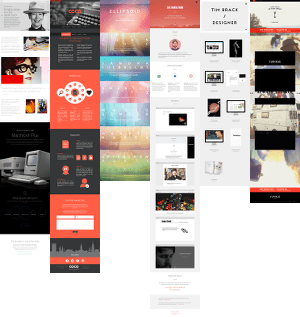
These days, and as juror for Design Made in Germany I see a lot of websites, many a designer knows how to make a page appear spacious, even grandiose. Alas, as many appear to have forgotten how to use space effectively, putting the content on the table, designing honestly and with focus.
It seems to have become an art form to start off dumbing down content “for” the user—or to begin with very little content—, grab a number of unrelated but pretty-to-look-at photographs or icons, garnish them with “HTML5,” misspelling intended, and throw it all on one endlessly scrolling—what could go wrong—page.
This type of contemporary web design is harmful. It’s harmful because it’s package design. It’s not content design. Personally, I’ve had it.
This type of design may match up nicely with the substance-void world the media shows us, but if that’s the best our profession can create then it’s not just my personal preference to endorse Craiglist-esque forms of design, but also my conviction that 1999 pragmatic table-based design has won a late round.
Web designers must be able to produce websites and apps that can handle, not attempt to pity, information density. Yes, there’s negative space and such. But there’s also such a thing as missing the point.
PS.
If you like a taste of numbers, a few months back, already suspicious of information-poor sites, I looked at a sample of popular sites and counted the words in the immediately visible section of an arbitrary 1,024×768 pixels browser window. Apple: 13 words; Microsoft: 15 words; CNN: 124 words; the New York Times: 294 words; Edward Tufte: 390 words. In comparison: a tweet: ø <23 words; a text message ø <27 words. But there’s more to do and say here, and so it’s fair to point out problems with these numbers.
About Me
I’m Jens (long: Jens Oliver Meiert), and I’m an engineering lead, guerrilla philosopher, and indie publisher. I’ve worked as a technical lead and engineering manager at various companies, including Google; I’m an open-source developer and a contributor to web standards (like HTML, CSS, WCAG); and I write and review books for O’Reilly and Frontend Dogma.
I love trying things, not only in web development and engineering management, but also with respect to politics and philosophy. Here on meiert.com I talk about some of my experiences and perspectives. (Please share feedback—interpret charitably, keep it friendly, but do be critical.)

